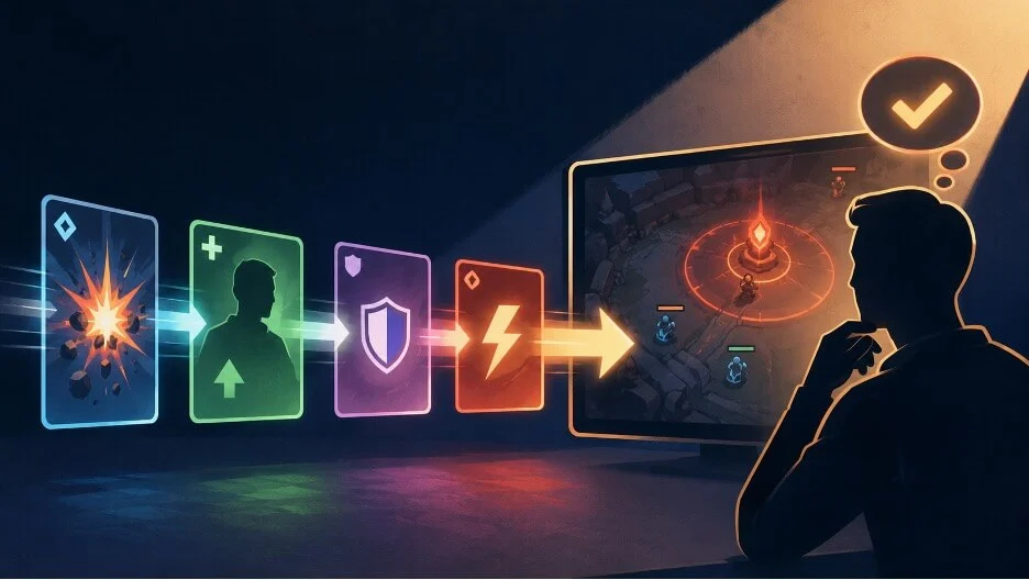
A fast interface can fail even when every individual element is legible. The trouble begins when several correct signals arrive together: a score changes, a resource falls, an objective opens, and a warning appears before the player has connected any of them. Readability therefore depends on continuity. The player needs to see what happened, understand which system value changed, recognize the cue that represents it, and know whether the next decision is different. This challenge, particularly pronounced in dynamic digital environments like competitive gaming, live sports analytics, and critical operational dashboards, underscores a fundamental principle of human-computer interaction: the information presented must not only be accurate but also comprehensible within the temporal constraints of its context. As digital experiences become increasingly complex and real-time, the design imperative shifts from mere clarity of individual elements to the seamless integration of information flow, ensuring users can consistently follow the narrative of evolving data.
The human cognitive system is adept at processing visual information, but its capacity is finite, especially under pressure. In high-stakes, fast-moving scenarios, the user’s ability to interpret and react to multiple concurrent updates is critical. Interface designers face the task of orchestrating these signals into a coherent story, allowing users to build a mental model of the system’s state and anticipate future actions. Without this continuity, even perfectly rendered icons or text can become noise, leading to confusion, delayed reactions, and ultimately, user frustration or suboptimal performance. The ramifications extend beyond mere inconvenience, impacting competitive outcomes in esports, financial decisions in trading platforms, and safety protocols in industrial control systems.
The Cognitive Demands of Rapid Information Processing
The inherent challenge of fast-paced interfaces lies in the discrepancy between the speed at which digital systems update and the speed at which human brains can effectively process and contextualize that information. When multiple changes occur simultaneously, the user’s attention is fragmented, making it difficult to establish causality or infer meaning. This phenomenon, often referred to as "cognitive overload," occurs when the volume or complexity of incoming information exceeds the processing capabilities of the user. In such situations, the brain resorts to selective attention, often missing critical cues or misinterpreting the relationships between events.
Consider the common scenario in a real-time strategy game or a multiplayer online battle arena (MOBA) title. Within milliseconds, a player might see their health bar drop, an enemy ability icon light up, a teammate’s status change, and a notification about a global objective appearing on the minimap. Each of these cues, in isolation, might be perfectly clear. The health bar indicates remaining hit points, the ability icon signifies a spell cast, and the minimap objective is self-explanatory. However, if these signals are presented without a clear connection—if the player cannot instantly relate the health drop to the enemy ability, or understand how the objective opening impacts their immediate tactical choices—the interface has failed to provide actionable information. The sheer volume and speed of these updates necessitate a design philosophy that prioritizes not just the presentation of data, but its narrative coherence.
Academic Insights: The League of Legends Study
A seminal contribution to understanding this challenge comes from a PLOS One study focusing on players of League of Legends, a prominent MOBA game. The research, published under the title "Visual attention in League of Legends: A comparison between expert and lower-skill players," offers compelling empirical evidence for the importance of efficient information gathering in complex, real-time interfaces. In a moderate task within the game, 11 expert participants demonstrated a significantly wider gaze distribution and shorter fixation duration compared to 9 lower-skill participants. This finding is crucial: it suggests that expert players are not simply faster at processing individual cues, but rather, they are more adept at scanning and integrating information across a broader visual field in a shorter amount of time.
This study illuminated several key points. Experts, through experience, develop highly efficient visual search strategies. They do not dwell on single elements but rapidly synthesize information from disparate screen regions. This "chunking" of information, where multiple individual cues are perceived as a single, meaningful unit, allows them to construct a holistic understanding of the game state. For instance, an expert might simultaneously register a character’s position, an enemy’s health bar, and a cooldown timer in a single, fluid glance, inferring immediate threats and opportunities. In contrast, lower-skill players often exhibited a narrower gaze, focusing longer on fewer elements, indicating a less efficient and more sequential processing of information. This difference in visual behavior implies that demanding play environments necessitate interfaces that facilitate rapid, distributed information gathering, making the relationship between cues as important as the clarity of each individual cue. If cues are isolated or require extensive cognitive effort to connect, they actively hinder the expert’s efficient scanning and the novice’s learning process. The study further highlighted that experts, on average, made critical decisions approximately 30% faster than lower-skill players, a difference directly attributed to their superior information processing capabilities, reinforcing the link between interface design and performance outcomes.
The Four Layers of Continuity: A Framework for Analysis
Fast-moving interfaces are easier to assess and optimize when each update is treated not as an isolated visual element, but as an integral part of a connected sequence. A cue, though clear on its own, can still fail if the player cannot relate it to the event that caused it, the system state it changed, or the decision that follows. The designer’s paramount task is therefore to preserve continuity from action to consequence. By tracing one event through each stage of its journey from occurrence to user action, designers can precisely pinpoint where this critical continuity weakens.
A practical review methodology involves tracing a single event through four distinct, yet interconnected, layers:
- The Source Event: This is the initial occurrence in the digital or real-world system. In a game, it could be an enemy player casting a spell, a character picking up an item, or a timer reaching zero. In sports, it’s a turnover, a successful shot, or a foul. This event is the raw input that triggers subsequent changes.
- The Changed System Variable: Following the source event, the underlying digital system updates one or more of its internal values. For example, a spell cast might reduce an enemy’s health variable, a picked-up item might increase a player’s inventory count, or a turnover might change the "possession" variable in a sports analytics system. These are the abstract, numerical, or logical changes within the system’s backend.
- The Player-Facing Cue: This is the visual, auditory, or haptic representation of the changed system variable presented to the user. It’s the health bar dropping, the item icon appearing in the inventory, the "Turnover" text flashing on screen, or an objective marker illuminating. This is the interface element the user directly perceives.
- The Newly Available or Altered Decision: Crucially, the cue should inform or modify the user’s next action or strategic consideration. A dropping health bar might prompt the player to retreat or use a healing item. An objective opening might redirect their movement. A turnover in basketball immediately shifts strategic priorities for both teams.
Consider a basketball possession that ends with a turnover and an immediate counterattack. The event is visible on the court: a player loses control of the ball. Digitally, this source event triggers updates to system variables such as possession (changing from one team to another), time remaining on the shot clock (which might reset), and derived values like turnover count for a player or team. For a viewer following the game during a live session at a platform like Lucky Rebel, those changes can arrive within seconds. The design question then becomes: can the viewer connect the cause (the physical turnover) and the consequence (the digital system updates and their implications) before the next event, such as a fast break basket, occurs? If a revised score or a new "possession" indicator appears before the turnover’s significance is clear, the interface presents an answer without showing the reasoning. Later in the same Lucky Rebel session, another possession may produce a similar visual burst while changing a different variable (e.g., a foul, a timeout), so the cue must indicate what moved rather than merely announcing that something happened. The same four-layer trace works for a combat HUD, a racing display, or a strategy panel because it follows the information’s journey, not the genre’s specific visual language. This systematic approach ensures that the "narrative of data" is always coherent and actionable for the user.
The distinction between these layers becomes clearer when raw events and interpreted measures appear together. A discussion of live, in-game sports information often mentions examples such as turnovers, shot quality, first-serve percentage, unforced errors, pace, and expected goals. For interface analysis, the useful role is classification rather than prediction. A turnover is a primary event. Possession is a state derived from events. Turnover rate is a derived measure or statistic. A designer must consciously decide which level of information matters now, which can wait, and, most critically, whether the displayed cue meaningfully changes the user’s next decision or understanding.
Identifying Points of Failure
Even with a clear understanding of the four layers, continuity can break at several critical junctures. Recognizing these common failure points is essential for effective interface design:
-
The Meaning Is Unclear: The first failure occurs when the event is obvious, and a cue is presented, but its meaning or impact on the system variable is unclear. A player sees an enemy glow, hears a warning sound, or watches a number fall without knowing whether the change affects damage output, movement speed, defensive capabilities, or turn order. The cue successfully attracts attention but fails to complete the thought process. It signals that something happened but not what it means in terms of game mechanics or user consequence. A stronger design explicitly connects the event to the affected value through consistent visual language, such as proximity (the number falling next to the affected stat), motion (an animation flowing from the event to the changed value), precise wording (e.g., "Armor Reduced"), or a brief, intuitive visual relationship (e.g., a shield icon flashing red). The player should not need to scan another corner of the screen or rely on prior knowledge to reconstruct what changed. The average reaction time for visual stimuli is around 200-250 milliseconds; any additional cognitive step to "decode" a cue directly adds to this, potentially delaying critical decisions.
-
The Cause Is Missing: The second failure reverses the problem: the consequence appears without its preceding cause. A timer shortens, an indicator changes color, or a character’s status effect appears after the relevant action that triggered it has already disappeared from the screen or the player’s immediate focus. This creates a disorienting sense of disconnect. The user sees a new state but lacks the context of why it changed, making it harder to learn from the interaction or predict future occurrences. This is particularly detrimental in learning new game mechanics or observing complex interactions. If a player’s debuff icon appears without them seeing the enemy cast the corresponding spell, they might misattribute the effect or fail to understand counterplay. This can be mitigated by brief, persistent visual trails, historical logs, or by ensuring the cue appears concurrently with or immediately after the event, even if the event itself is fleeting.
-
Competition for Attention: The third and often most insidious failure is competition. Several cues may all be individually accurate and well-designed, yet become collectively unreadable because they demand the user’s attention at the same moment. This creates a "visual noise" problem, where the interface overwhelms the user with too much information simultaneously. Imagine an intense combat sequence where a player simultaneously sees their health drop, an enemy’s critical hit indicator, a new quest objective notification, a resource regeneration pop-up, and a global chat message. Each cue might be perfect on its own, but their simultaneous presentation leads to cognitive paralysis. Designers can reduce this conflict by strategically asking: Which change most directly alters the user’s next immediate action? That cue receives immediate and dominant emphasis, perhaps through a larger animation, a prominent position, or a unique sound. Secondary information, while still important for long-term strategy or detailed understanding, remains available but without interrupting the primary decision-making flow. This might involve displaying it in a less prominent area, using smaller visual cues, or employing a brief delay before it appears, allowing the primary cue to be processed first. Studies in cognitive psychology suggest that humans can effectively attend to only about 3-4 items simultaneously in short-term memory; exceeding this limit rapidly degrades performance.
Strategic Cue Design: Giving Every Cue a Specific Job
To combat these failures, designers must adopt a disciplined approach to cue design, ensuring that every visual or auditory signal serves a clear, prioritized purpose. Priority should always follow the immediate next decision the user needs to make, rather than being dictated by mere visual drama or system importance.
A large, flashy animation might be appropriate for a decisive objective change in a game (e.g., "Nexus Destroyed!"), signaling a game-ending event that demands immediate and absolute attention. However, a small, subtle positional shift or a brief numerical update may be perfectly sufficient for a secondary statistic, such as a minor increment in a resource counter or a slight adjustment to a player’s score. The key is proportionality: the visual weight of a cue should match the urgency and impact of the information it conveys.
Persistent values, like a player’s current currency or an ongoing timer, should remain stable enough in their display to be easily scannable at a glance without drawing undue attention. Their visual presentation should facilitate quick reference, not interrupt flow. Conversely, temporary alerts or warnings should appear distinctly and disappear only after completing their explanatory job, ensuring the user has registered the message. They should not linger unnecessarily, adding to visual clutter, but also not vanish before they are processed.
Furthermore, redundancy in encoding critical information is a powerful tool. When color carries a warning (e.g., red for danger), shape, position, or accompanying text should reinforce it. This ensures that the meaning does not depend on color alone, which is crucial for accessibility (e.g., for colorblind users) and for robustness in varied viewing conditions (e.g., different screen calibrations, lighting environments). For example, a "low health" warning might be red, but also involve a distinct flashing animation, a specific icon shape (like a broken heart), and explicit text ("CRITICAL HEALTH").
A 2025 Smashing Magazine analysis of real-time dashboard design, though focused on operational dashboards, makes a highly relevant distinction: the use of hierarchy, grouping, color, and restrained motion should be determined by what the user needs to decide at that moment. Rapidly changing displays can become overwhelmingly difficult to follow when updates lack context or when several alerts aggressively compete for attention. While a game HUD is not an industrial operational dashboard, the same fundamental design test applies. Every prominent cue should unequivocally help the player identify the current state or recognize the next relevant action. Information that requires slower interpretation, such as detailed statistics or historical logs, can and should remain available in a less obtrusive manner, without competing with an immediate warning or critical decision point. This strategy allows users to progressively disclose information as needed, reducing cognitive load during high-pressure moments.
Industry Perspectives on Real-Time UI/UX
Leading UI/UX experts and game developers consistently emphasize the need for a user-centric approach that anticipates cognitive processes. Dr. Eleanor Vance, a cognitive psychologist specializing in human-computer interaction, notes, "The most common mistake designers make is assuming that because they understand their system, the user will too. In fast interfaces, clarity is less about individual elements and more about the seamless narrative of data. We need to design for ‘perceptual chunking’—helping the brain group related information instantly."
Similarly, Marcus Thorne, a veteran game designer known for his work on competitive titles, states, "For a competitive game, every millisecond counts. Our job isn’t just to show information, but to present it in a way that guides the player’s attention and decision-making. If a player has to stop and think ‘What just happened?’ for even half a second, we’ve failed. We aim for an intuitive, almost subconscious understanding of the game state through well-orchestrated cues." This sentiment is echoed across various industries where real-time data is critical, from financial trading platforms where market changes dictate immediate action, to air traffic control systems where rapid updates are essential for safety.
A Practical Testing Methodology
The theoretical understanding of continuity and failure points must be translated into practical testing. A highly effective and straightforward method involves pausing a prototype immediately after one meaningful event and asking four critical questions:
- What caused the change? (Tracing back to the Source Event)
- Which system value moved? (Connecting to the Changed System Variable)
- Which cue communicated it? (Identifying the Player-Facing Cue)
- What decision is now available, altered, or no longer relevant? (Linking to the Newly Available or Altered Decision)
If any answer to these questions requires guessing, extensive mental reconstruction, or consultation of an external guide, then the chain of continuity is broken. This immediate feedback loop is invaluable during the design and development process. For instance, if a player observes their character’s "Mana" resource drop but cannot confidently state which specific spell they just cast (Question 1), or if they see a "Damage Dealt" number pop up but aren’t sure which enemy’s health was affected (Question 2), the interface needs revision. If a warning appears but the player doesn’t know what action they should take next (Question 4), the cue has failed its ultimate purpose.
The fix may involve a stronger visual hierarchy, perhaps making the most critical information larger or more central. It might also require better timing, ensuring the cue appears at the optimal moment relative to the event. Clearer grouping of related information (e.g., all player stats in one corner, all enemy stats in another) can also significantly improve readability. Sometimes, the solution is simply the removal of a redundant or low-priority alert that is merely adding noise.
After conducting this pause-and-question test for individual events, the next crucial step is to repeat the test at normal speed, and then with several events occurring very close together. A cue that functions perfectly in isolation may completely disappear or become unintelligible when embedded within a crowded, fast-paced sequence. This simulates the real-world conditions of dynamic interfaces. Readability in fast-changing game states, and indeed in any real-time interface, is truly achieved when cause seamlessly leads into state, state robustly leads into a clear cue, and the cue effectively reaches the player’s comprehension before the next important decision demands their attention. That unbroken sequence, from event to actionable insight, is the ultimate test of an interface’s effectiveness in dynamic, real-time environments.
Broader Implications and Future Outlook
The principles of designing for continuity in fast-paced interfaces extend far beyond competitive gaming. In financial trading platforms, a rapidly changing stock price (source event) updating a portfolio value (system variable) must be clearly linked to a buy/sell button (cue) to inform an immediate trade decision. In autonomous vehicle dashboards, environmental sensor data (events) updating obstacle detection (system state) must be presented via clear visual or auditory warnings (cues) to prompt driver intervention (decision). Even in consumer applications, like live sports betting or dynamic news feeds, the ability to digest and act upon rapidly changing information dictates user engagement and satisfaction.
As augmented reality (AR) and virtual reality (VR) interfaces become more prevalent, the challenge of maintaining continuity will intensify. Information will not just be on a screen but integrated into the user’s physical environment, demanding even more sophisticated contextual awareness and less intrusive cueing. Future UI/UX design will increasingly lean on adaptive interfaces that can dynamically adjust the prominence and timing of cues based on user skill level, current cognitive load, and the perceived urgency of the information. This will involve more intelligent systems that understand the user’s intent and present information proactively, rather than reactively, further blurring the lines between system and user understanding.
Ultimately, the goal of designing fast interfaces is not to simply display data, but to empower users to make informed decisions swiftly and confidently. By meticulously tracing the journey of information through its four layers, identifying points of failure, and strategically prioritizing cues, designers can transform potentially chaotic data streams into coherent, actionable narratives, fostering a truly intuitive and responsive user experience across all dynamic digital domains.
About the Author